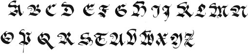
|
LA GOTHIQUE FRAKTUR
© Julien Chazal
![calligraphie, chancelière, alphabets, lettres, stages et cours, mail-art, enveloppes calligraphies, logos, calligraphy](../../../Images/PEDAGOGIE/Calli-Historiques/Goth-Fraktur/Goth-Fraktur-minus.jpg)
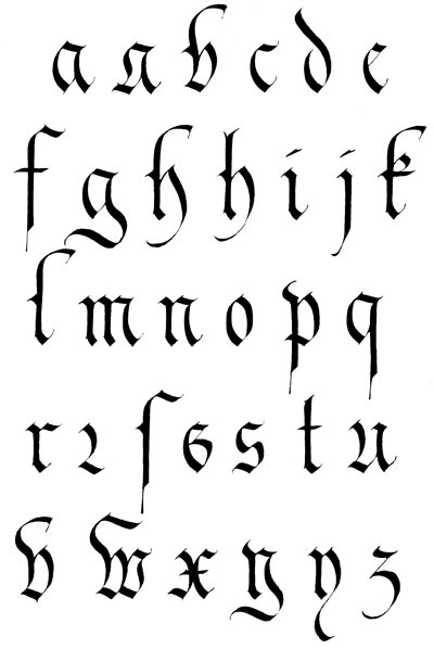
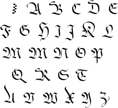
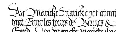
Grande sœur de la Gothique Textura, plus haute et plus arrondie, elle a été utilisée jusqu'à très recemment. Des boucles ornementales accompagnent souvent cette écriture, surtout avec les majuscules. |
|
|
|
![calligraphie, chancelière, alphabets, lettres, stages et cours, mail-art, enveloppes calligraphies, logos, calligraphy](../../../Images/PEDAGOGIE/Calli-Historiques/Goth-Fraktur/Goth-Fraktur-cap.jpg)
![](../../../Images/PEDAGOGIE/Calli-Historiques/Goth-Fraktur/Goth-Fraktur-d.jpg)
![calligraphie, chancelière, alphabets, lettres, stages et cours, mail-art, enveloppes calligraphies, logos, calligraphy](../../../Images/PEDAGOGIE/Calli-Historiques/Goth-Fraktur/Goth-Fraktur-a.jpg) |
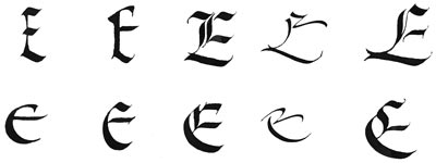
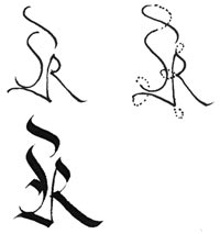
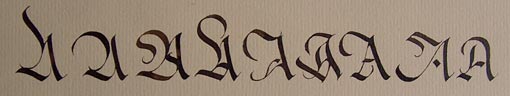
L'évolution des capitales gothiques, de la forme Rustica et de l'Onciale vers la Gothique Primitive, Textura, Cursive et Fraktur. |
|
|
|
|
|
|
![](../../../Images/PEDAGOGIE/Calli-Historiques/Goth-Fraktur/Goth-Fraktur-b.jpg)
![](../../../Images/PEDAGOGIE/Calli-Historiques/Goth-Fraktur/Goth-Fraktur-f.jpg)
![](../../../Images/PEDAGOGIE/Calli-Historiques/Goth-Fraktur/Goth-Fraktur-vari.jpg)
![](../../../Images/PEDAGOGIE/Calli-Historiques/Goth-Fraktur/Goth-Fraktur-var.jpg) |
|
|